SEO . SMART . FLEXIBLE . BEAUTIFUL
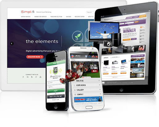
That is what Svend Responsive Web Design is all about! Let’s do your site!
A responsive theme will automatically adjust the layout, menu items, and images to render nicely on desktops, laptops, tablets, and mobile devices.
Google suggests a responsive design to encourage a better online experience (and they’ll give you a boost in the SERPs if you do so). Google has also been testing out an addition to the SERPs. When users are searching on mobile devices, Google will show a mobile icon indicating to the searcher that those sites are mobile friendly. Make sure your website is as accessible as possible.